For many UK savers, investing close to home feels safe. Familiar companies, sterling-denominated assets and the reassuring sense of being on ‘home turf’ have long guided how portfolios have been built. But this comfort comes at a cost. Since the Global Financial Crisis (GFC), UK equities have lagged behind their global peers, while sterling has steadily lost ground against major currencies. Investors who concentrated on domestic markets only have often missed out on stronger growth abroad, and the risk they thought they were avoiding has shown up in another form, lower returns.
Home bias isn’t just a quirk of habit; it’s a drag on wealth-building. No one country has a monopoly on great ideas or creating great businesses. For savers planning for retirement, home bias can materially weaken long-term returns and reduce sustainability of future withdrawals.
How Attractive Is the UK to Global Investors today?
1. What Does a Weak Pound Mean for UK Savers and Retirees?
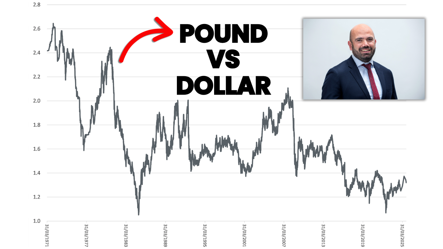
Perhaps the simplest way to evaluate the UK’s standing in the world is to review the soundness of its money; the relative value of British pounds versus the US dollar (the dominant global currency; the main central bank reserve, trade settlement unit and financial benchmark worldwide, see Chart 1).
Chart 1: ‘Cable’ (the USD/GBP exchange rate) 1971-2025
Source: FRED, https://fred.stlouisfed.org/series/DEXUSUK, 29/10/25
Bilaterial changes in relative currency value over the long term provide an elementary insight into international views of how the UK has fared economically, competitively and in terms of stability. Suffice to say, UK focused investors have seen a persistent and long-term decline in their purchasing power relative to the US. Modest strength year-to-date versus the dollar appears like a blip. The more comprehensive REER[1] measure, against a basket of currencies, also shows GBP has weakened significantly in real, trade weighted terms long-term, supporting the bilateral analysis.
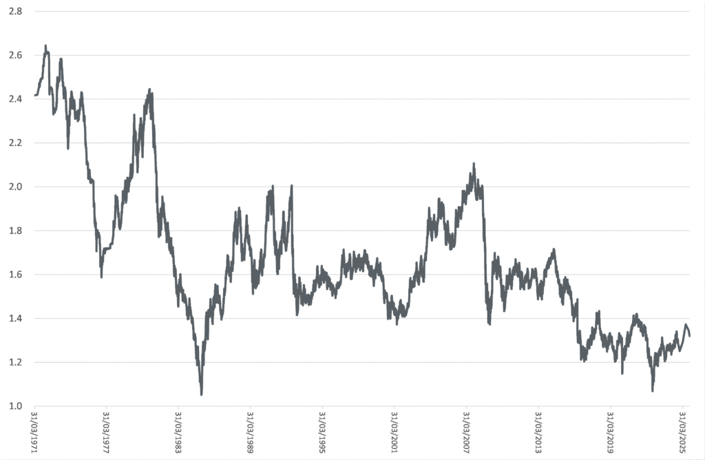
2. Are Rising Gilt Yields a Warning Sign for UK Investors?
Another way to assess how others are evaluating the merits of investing in the UK is to review long-term UK government bond yields. The yield is the coupon on the bond (the fixed interest payment at the time of issue) divided by the market value of the bond. In brief, UK government bond yields have risen sharply over the past several years (see Chart 2), driven by higher levels of inflation, prompting higher Bank of England base rates and expectations for higher future interest rates. Yield levels are important, recall Liz Truss’s premiership was prematurely ended by a mini crisis in yields, following the announcement of unfunded tax cuts.
[1] Real Effective Exchange Rate
Chart 2: UK 2 and 10-year UK government bond yields (Jan-2010-Oct-2025)
Source: markets.ft.com/data/bonds/tearsheets
Yields are driven by current Bank of England interest rates, expectations for future interest rates (incorporating a view on rates of inflation / growth and perceptions of credit worthiness) and time-horizon (‘term premia’). Yields move inversely to prices. In other words, higher yields correspond to lower bond prices. From a government perspective, higher yields equal higher interest costs.
Today’s higher yields are implying that the lines between monetary and fiscal policy have blurred, as the sheer size of central bank balance sheets (as owners of government debt) compromises their policy objective. Put another way, inflation targeting risk is increasingly priced-in to gilt yields as buyers no longer believe in the 2.0% inflation target. The increase in yields is also likely driven by issuance premium, because so much UK debt must be funded, as demand from buyers shrinks[1].
It is important to point out that the ‘spread[2]’ (gap) between 10-year UK government bond yields and near peers in Europe (such as Germany at close to 180bps) are near highs[3]. It is humbling that current yields on 10-year government debt of the infamous ‘PIGS’[4] are significantly below prevailing UK rates . Why? Since the GFC, the UK has gradually become viewed as riskier than these peers, due to persistent high borrowing, weak growth and high inflation. Although the success of the current Labour administration’s efforts to improve the growth rate in UK GDP can be viewed as open to debate, the implicit views of the UK bond market appear clear.
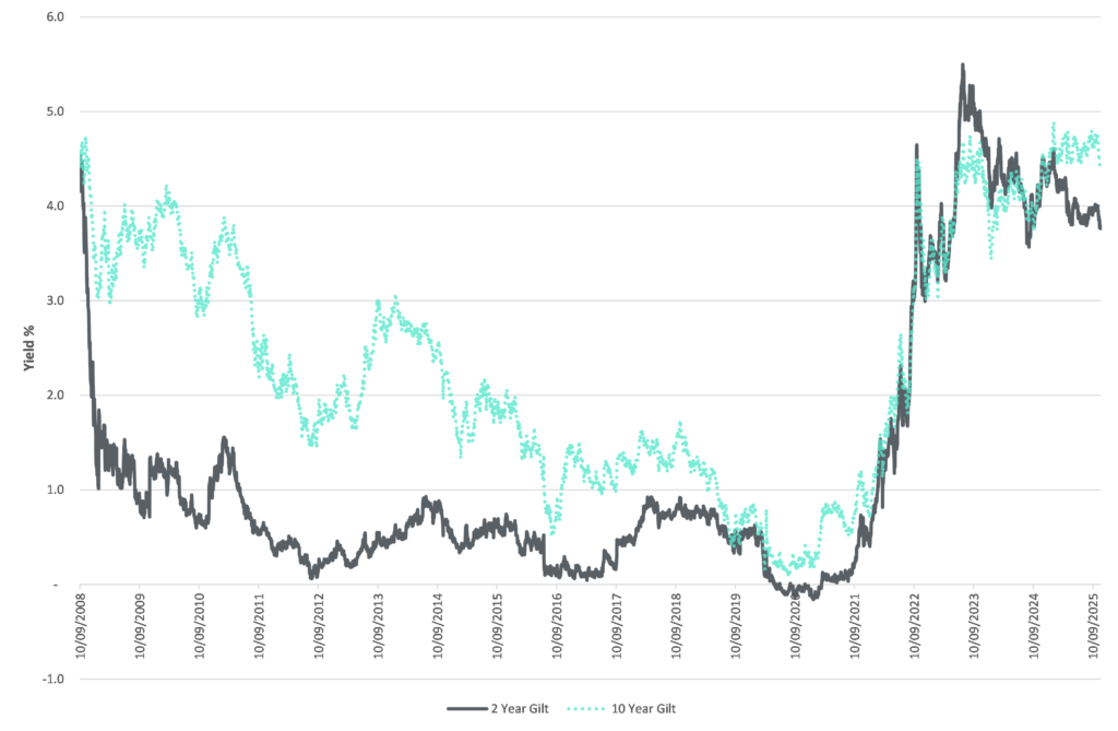
Why Has the UK Stock Market Underperformed Global Markets?
For UK savers, sticking largely to domestic shares has come with a hidden cost. Since the lows of the Global Financial Crisis (2009), UK equities have consistently lagged global markets[5] (see Chart 3). The stand-out performer has been the US (the S&P500, a proxy for the US equity market).
[1] See Matt King for more details https://www.ft.com/content/121b9420-d929-4919-bd18-9059aa241696
[2] The difference between yields of different country bonds.
[3] Bps – Basis points, one hundredth of one percentage point, mainly used to describe differences in interest rates.
[4] Portugal, Italy, Greece, Spain, an anacronym made popular in 2009-2010 during the European debt crisis.
[5] As of October-2025, the US accounted for 65% of Global (ACWI) according to MSCI.
Chart 3: Returns in GBP (2009-2025), S&P500, Topix, FTSE-100 and MSCI EM
Source: Yahoo Finance, 30/09/25, index returns in GBP.
Mind the gap! Before considering fees and taxes, savers who put £10,000 into the S&P 500 in the dark early days of March 2009, would now be sitting on around ~£118,000 in gross terms[1]. Savers with home bias, sticking solely with the FTSE-100, would have nearer ~£43,000. This includes the value of dividends over this timeframe and assumes their re-investment. In fairness to the FTSE-100, the Emerging Markets (EM) and Japanese (Topix) equity indices have also materially lagged the US.
Several factors help explain why UK equities have struggled. The UK market is dominated by a small number of large multinational companies and heavily weighted toward financials and to a lesser extent commodities. By contrast, US and Asian markets have benefited from fast growing sectors, areas where the UK is under-represented. Chart 4 shows the sector make-up of the UK’s indices (including the mid-cap focused FTSE-250) vs its main US (S&P 500) and Global (MSCI ACWI) peers.
[1] As of mid-September-2025, the time of writing.
Chart 4: Sector composition comparison, the UK vs the US and the World
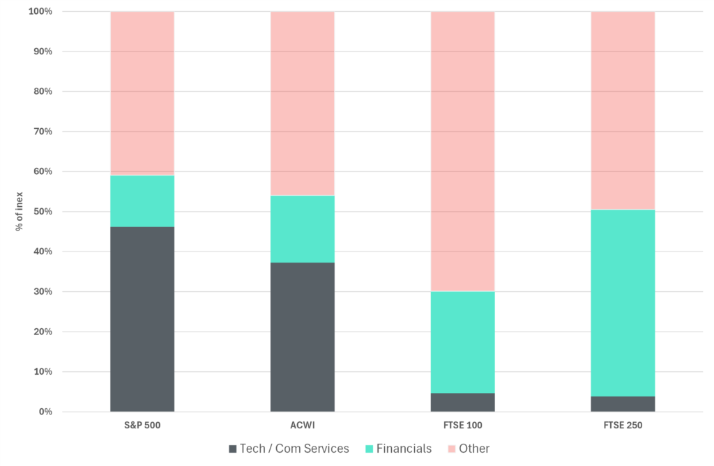
Source: Morenti Wealth, FTSE, S&P & MSCI factsheets. Com Services = Communication Services. In the S&P 500 and ACWI indices this includes companies such as Alphabet (Google) & Meta (Facebook). The UK’s FTSE indices have no equivalent sector classification. Low growth Telco Services in the FTSE indices (e.g. Vodafone, BT) have been re-classified as ‘Com Services’ for the purpose of this analysis.
In short, the UK does not have an NVIDIA or Taiwan Semiconductor equivalent, both current leaders in the generative AI boom. The UK does not have a “Mag7”. This refers to seven of the largest U.S. technology-driven companies; Apple, Microsoft, Alphabet (Google), Amazon, Nvidia, Meta (Facebook), and Tesla, that have dominated U.S. stock market performance in recent years. These companies are viewed as leaders in areas like cloud computing, artificial intelligence, e-commerce, electric vehicles, and digital advertising, and their combined market capitalization makes up a significant share of the S&P 500. In our view, this underlines the importance of a global perspective.
Although the ‘American Exceptionalism’ theme has delivered incredible performance in the recent past, UK savers should also be aware of potential hazards. Owning an S&P index tracker carries concentration risk, meaning any reversal in the fortunes of the Mag7 could severely impair US equity index performance in the future.
Recognizing the truism that negative argument tends to look smarter (and optimism is often a trickier disposition to articulate), many have described the Mag7 as a valuation bubble, focusing on the huge amount of capital investment going into their end markets, minimal game-changing ‘use-cases’ to date and fears expected growth will disappoint. This requires careful monitoring.
Baby’s and bathwater. Whilst there are always exceptions and the FTSE-100 has performed more strongly year-to-date, UK investors seeking out innovative, fast growing high quality listed companies in the UK face a structural headwind.
Should UK Investors Rely on AIM or Small-Cap Shares for Growth?
In theory it is possible for UK savers to gain exposure to faster growth, innovative businesses, via UK Small-Cap (e.g. FTSE Small Cap, MSCI UK Small Cap indices, with access via a variety of actively managed and ETF products) and FTSE AIM Indices. Past performance suggests these are different beasts that should be treated with caution by savers (see Chart 5).
Total returns from the MSCI UK Small-Cap[1] index since March-2009 have significantly lagged the large cap global index (ACWI) and modestly underperformed the FTSE-100 (Chart 5). AIM returns have been poor, continuing a long-term structural trend. This is before we consider risk.
For the uninitiated, large-cap stocks can be thought of like big cruise ships: they’re slower to turn and more stable in rough seas, while small-cap stocks are like small sailboats; nimbler but tossed around much more by waves. Because small companies have fewer resources, less diversified businesses, and their shares trade less frequently, their prices swing more wildly than large, established firms. This is borne out by volatility data published by the major index providers.
The FTSE-100 factsheet indicates a 5-year volatility of 10.5% (to end-Oct-25). The MSCI UK Small-Cap index had volatility of 16.7% for the same period[2], the AIM 50, 17.7%. Using a ‘Sharpe ratio[3]’ to estimate a ‘risk-adjusted return’, UK investors have NOT been compensated for taking risks here.
[1] We use the MSCI UK Small-Cap index, as opposed to the FTSE Small-Cap index, as in our view the MSCI index is a truer sample of UK small / micro cap than the FTSE index which has a bias to more liquid mid-sized firms.
[2] See https://www.lseg.com/en/ftse-russell/index-resources/factsheets for latest data
[3] The Sharpe ratio measures how much excess return an investment makes for every additional unit of volatility.
Chart 5: The approximate value of £10,000 invested in Mar-09 held to end Sep-25
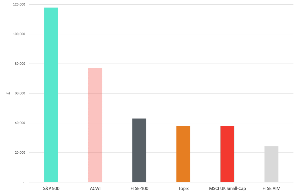
Source: Yahoo Finance, 15/09/25, total returns data in GBP ignoring transaction costs and taxes.
AIM was originally launched to provide a public market for smaller, younger, and fast-growing companies, with lighter touch regulatory requirements, and allow these businesses to access equity capital to fuel expansion. Whilst it was always understood AIM would be higher risk than its larger UK index peers and suffer from survivorship drag (successful firms move to the main market), index level returns have been described as a ‘lasting puzzle’ by respected academics.
AIM and IHT Relief: A Valuable Incentive, But Not a Substitute for Fundamentals
The relatively weak performance of AIM is also a salutary lesson in letting tax considerations alone, drive savings decisions. As many will know, AIM shares held for greater than a two-year period, qualify for 100% inheritance tax relief. This is due to change to a 50% relief on qualifying shares in April-2026. Given AIM’s past track record, a very high conviction bottom-up case for an individual company must be in place, before any investment should be considered.
What Should UK Savers Do Next? A Case for Global Diversification
The message for long-term UK savers is clear: the world is constantly changing, and portfolios must change with it. UK shares have lagged their global peers for a very long time, sterling has steadily lost ground on the world stage since the days of the British empire, and even UK government bonds, once seen as a safe cornerstone, have struggled to offer consistent protection. Siren calls from the AIM market must be approached with extreme caution. Sticking too rigidly to “home turf” means missing opportunities abroad and carrying unnecessary risk at home.
Diversifying across geographies, asset classes, and currencies isn’t about abandoning the UK, it’s about giving your savings a better chance to grow and withstand shocks. Whether through low-cost passive funds, selective active managers, or a mix of both, the right global strategy can put your money to work more effectively.
For those seeking guidance we intend to create more detailed content about different asset classes and investments in the near future. In the meantime, Morenti Wealth’s Chris Bourne covers the nuances in selecting a core Global strategy in the YouTube video ‘The Only Index Fund I Use’.
Making choices well takes clarity and discipline. Independent specialists such as Morenti Wealth can help challenge old habits, explore product nuances, weigh costs carefully, and build a plan that optimises risk and return over the long term. This could make all the difference to realising your financial objectives.
If you would like to receive more information from Morenti Wealth, including our latest research and insights sent directly to your inbox, please click here.
About Morenti Wealth
Morenti Wealth is a trading style of Burgess & Lee Ltd, an independent financial advice firm specialising in retirement and inheritance tax planning. Morenti Wealth focuses on delivering clear, actionable strategies tailored to clients’ unique goals, stripping away unnecessary complexity and costs. Burgess & Lee is authorised and regulated by the Financial Conduct Authority (FCA).
Disclaimer
This report is for information only and does not constitute personal financial advice. We strive to provide accurate and up-to-date information, but investments carry risks, including the potential loss of capital. This article does not consider your individual circumstances. You should seek personalised advice before making financial decisions.